Premium packaging design for Kopparberg, featuring "The Artisan Pear" label on a dark bottle, surrounded by fresh green pears to emphasize the natural, craft-led branding.
Bold, minimalist packaging for The Tofoo Co. range, showcasing the brand’s signature chunky typography and vibrant accent colors (white, yellow, and red) on a modern kitchen backdrop.
Heritage-driven tea box designs for Ringtons, featuring a refreshed colour palette and elegant floral motifs that modernise the historic Newcastle brand for today’s market.
Natural and trustworthy branding for Harringtons dog food, utilizing high-quality pet photography and a clear "natural choice" messaging layout on the front-of-pack.
Dynamic redesign for Cadbury Dairy Milk ice cream tubs (produced by Froneri), using high-energy product photography of a scoop and chocolate shards against the iconic Cadbury purple.
High-impact, shelf-ready packaging for Seabrook Waves crinkle-cut crisps, using a color-coded system and bold, wavy graphics to represent different flavor profiles.
Packaging design for Wensleydale Creamery featuring the iconic green "Original Yorkshire Wensleydale" label and cow logo, displayed in a rustic outdoor lifestyle setting.
Versatile packaging design for Primula cheese spread tubes, showing the "Deli" and "Cheddar" ranges with fresh ingredient photography to highlight product usage and versatility.
Eye-catching ice cream sandwich packaging for Lotus Biscoff, prominently featuring the iconic red brand logo and a "pull-tab" style reveal of the product inside.
Vibrant, high-energy can designs for the Boost Juic’d energy drink range, featuring a "burst" logo and bold, fruit-inspired gradients to appeal to a younger, active audience.
Authentic, farm-to-table branding for Glebe Farm Pure Oaty oat milk, using a rustic "hand-drawn" style logo and field-based photography to reinforce its British provenance.
Premium packaging design for the Co-op Irresistible chocolate range, featuring vibrant, hand-illustrated botanical and wildlife patterns on a rustic wooden backdrop.
A cohesive and striking brand identity refresh for Saltaire Brewery’s core bottle range. The design features a bold, geometric "shield" label system with vibrant colour-coding for each variant—including Triple Choc, Titus, and Cascade—to ensure clear range navigation and maximum shelf standout. The minimalist "SB" monogram and clean, sans-serif typography modernise the heritage brand while maintaining its craft-led roots, all presented against a rustic, weathered wooden backdrop.
A closer look at the Bella & Duke visual identity, highlighting the clean typography and ingredient-focused imagery that communicates the nutritional value of raw feeding.
Dynamic packaging design and brand identity refresh for Poppets!, featuring a high-energy "floating" composition of the Minty, Toffee, and Orangy boxes. The vibrant, colour-coded packs are surrounded by individual chocolate spheres and detailed product cross-sections, showcasing the creamy and chewy centres against a bold, high-impact red background.

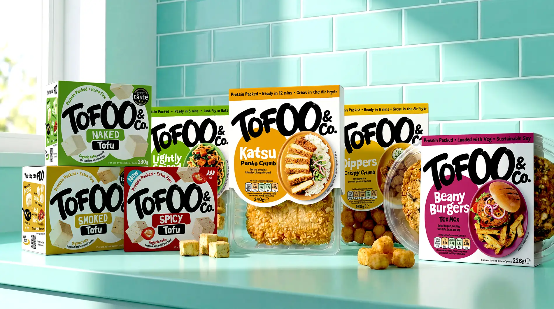
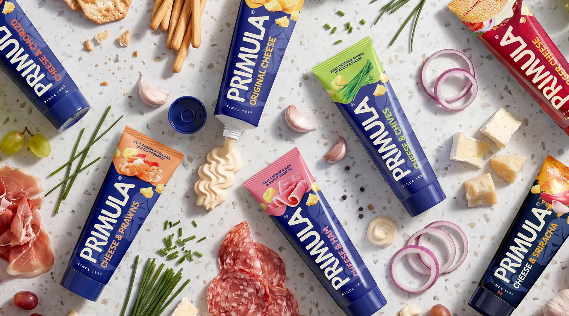
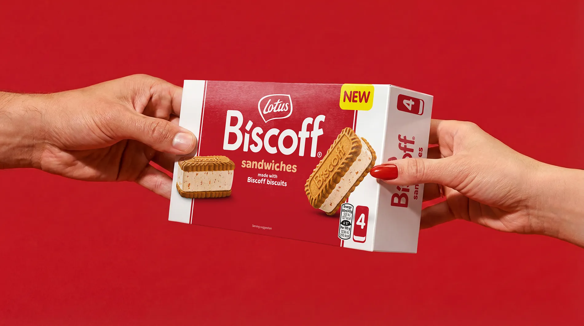
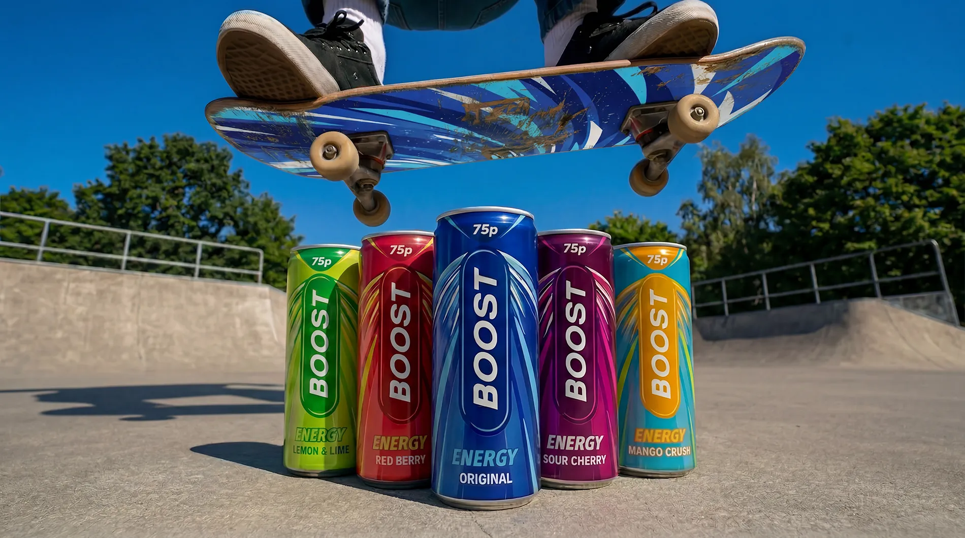
We’re a branding and design team who specialise in creating compelling and effective work in the FMCG space.

From start ups to established global names, we help to create, evolve and redefine both food brands and non-food brands and their packaging by using supremely talented people who work hard, think bravely, don’t waffle and (we’re confident) you’ll want to work with.

Two women in an office, one smiling while standing and the other sitting behind a laptop, with colorful geometric shapes overlaid.
Two men in a meeting room, one smiling in a red shirt and the other listening intently in a green shirt, with abstract green and blue graphic shapes overlaying the image.

We believe our best results come when we strip away the noise and just get to work. No unnecessary ‘agency speak’. We solve creative problems with a calm head and a genuine love for what we do, positive energy, smart design and a process you’ll actually enjoy.

Backed by the global footprint of IMA, we combine world-class thinking with local execution at scale. We're curious enough to find the magic and confident enough to run with it.

Man wearing glasses working on a MacBook laptop while sitting on a beige couch in a dimly lit modern indoor space.

Client Experience

WHSmith logoFroneri logoCadbury logoKopparberg logoFlorette logoPrimula logoCOOP logoRingtons logoPets at Home logoManomasa logoOcean spray logoOreo logoToblerone logoMilka logoBarr logoHarrogate Spring Water logoSeabrook logoMug Shot logoHarringtons logoFox's logoButchers logoBoost logoFish Said Fred logoZero logoJacksons logoIceland logoNaked logoWhitworths logoPrinces logoGlebe Farm logoMorrisons logoTofoo & Co logoCalbee logoBella & Duke logoPoppets logo