A fresh design for Yoomoo’s vegan ice lollies
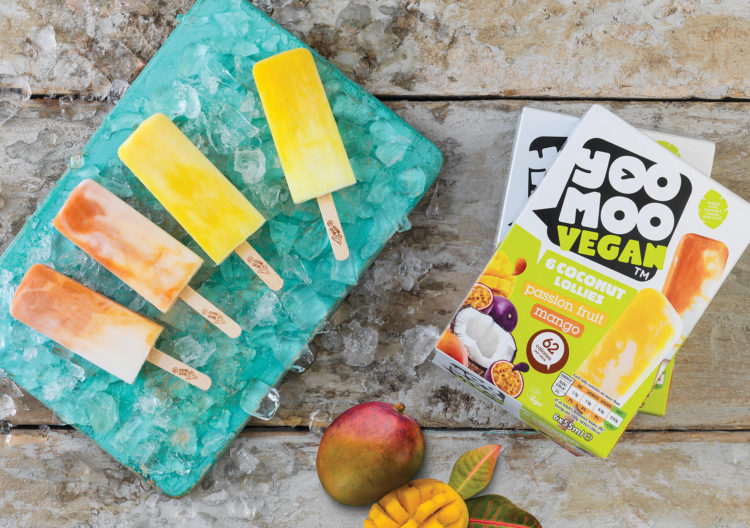
As consumers look for lower calorie versions of their favourite everyday desserts, the desire for vegan alternatives continues to grow. The UK’s number one frozen yoghurt brand is a favourite among the health-conscious shopper and with plant-based lifestyles on the rise, Yoomoo has responded with a coconut cream ice lolly, inviting consumers to try a new flavour.
Following our successful evolution of the Yoomoo ident last year and building on the heritage of the brand, we received the brief to convey the clear message that plant-based means absolutely no compromise on taste.
Yoomoo uses coconut cream and fruit as an alternative which is clearly shown in the packaging design. Our insight and findings led to a fresh zesty palette of green and white blending into crisp images of exotic fruits and luscious coconut. The word vegan is incorporated into the logo and a palm leaf reinstates the tropical ingredients. The design differentiates from the core yoghurt product but sits seamlessly alongside the rest of the range when merchandised together.
David Whittle said: “It was great to work on this project with Yoomoo as they evolve into the vegan market. Retaining the Yoomoo ident could have been tricky for this line but the placement of effective imagery and making the word vegan a bold focal point conveys the message clearly. We removed the cow branding but developed the speech bubble, retaining the much-loved wink within the ident to connect with the consumer at point of purchase.”
Building on the fresh fruity look that identifies the brand, incorporating the cheeky Yoomoo wink and with a stamp of approval from The Vegan Society, this is packaging with standout appeal from its competitors in the freezer. Yoomoo coconut ice lollies are available at Waitrose and Ocado.
